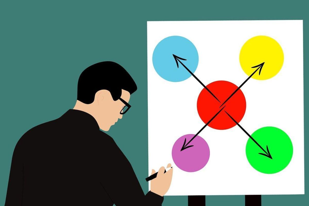
Understanding the colors matters a lot as they can also affect user behavior. Just like Picasso once said, colors are like features.
They would change, following the flow of emotions. In web design, colors are not only decorative features. It may act as a powerful tool to affect someone psychologically.
By using the proper colors, you may effectively strengthen your brand identity, arouse certain feelings, or influence others to do certain tasks.
However, you need to be careful when using colors as they can either break or enhance the user’s experience. In order to apply the proper colors better, see more information below.
Table of Contents
ToggleCan Simplicity Affect User’s Behavior?
Yes, the easier users may access things on your website, the better. However, we do know that it’s not that easy to design a website that’s pleasing to the eye, responsive, and easy to access.
Therefore, if you’ve found it hard to design yourself, you can use a cheap website builder. Don’t let the affordable pieces deceive you. With such a low cost, you may freely create your dream website.
Another thing that’s good about these website builders is the fact that they are pretty customizable. You may freely change anything there, from the designs, colors, and other visual elements to your liking.
Before making any changes to the colors, it would be best for you to first understand how colors may influence user behavior.

How Colors May Influence User Behavior
There’s a color psychology theory that tells us a connection between someone’s emotion and the usage of certain colors. Some colors may reflect a certain emotion better than others.
For example, the red colors usually reflected anger, anguish, or bravery. On the other side, black resembles nothingness, emptiness, or limbo.
Someone may have their own preferences for certain colors, and it can be affected by personal or cultural experience. The red color alone may have different meanings in different cultures.
Seeing the different interpretations shows that there’s indeed a connection between colors and emotions. So if you want the readers to feel a certain emotion, you’ll need to strike with the suitable colors.
How To Use The Proper Colors At Your Advantage
Colors also have certain effects on brand identity. People may recognize your brand better when they see your color. Usually, brands would use primary and secondary colors to display their brand identity better.
For example, Coca-Cola uses a combination of red and white colors to spark a sense of excitement. When we think about Coca-Cola, the associated color is red.
The same thing also goes for McDonald’s. Although they use red as their primary color, they also include the iconic yellow color for their icon.
So it’s essential to use colors that may represent your brand better. And of course, researching the colors could take more time, which is expected.
Thus, no matter what designer tools for web designer you use, make sure to pay attention to important factors, including colors.
Colors = Emotions
When you see a blue color, what’s in your mind? Is it anger? Or is it calmness? Most people would choose the second one.
Why is that? It’s because colors may emit emotions. You can’t simply use the red colors if you want to spark warmth or harmony. Instead, you should use the green and yellow colors.
Triggering emotions through colors is not a new practice and has proven to be effective in affecting user behavior. So during web designing, ensure to apply the proper colors according to the goals.

How To Correctly Apply Colors To UI Design
Choosing the proper colors is important not only for enhancing the visual but to evoking certain emotions and grabbing the audience’s attention.
To guide the user’s attention, you may use the colors that are bold, like blue or red. That’s the very reason why the links are always colored in blue. When the users see these blue links, there’s a chance that they will click them.
Aside from using the appropriate colors, make sure to place them strategically. When you put the colors in their proper places, you could affect users to take actions, like making a purchase.
Using warm colors is a good idea if you want to make the website look friendlier. Using orange or red may also evoke a sense of excitement.
So when they see the color the moment they open the website, they would feel more intrigued to find out what’s next.
You can also use the same bright colors, like yellow, for example, to highlight some important information, like discounts or promotions.
This would make the information look clearer to the audience, and they will likely make a purchase that way.
To make your brand identity stronger, make sure to use the same colors. Be careful when picking a color palette that’s in line with your brand’s identity, goals, and visions.
Also, it’s always important to be consistent in applying the same colors so the audience will remember your brand better the moment they look at the colors.


